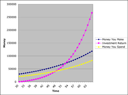
This chart shows a graphical interpretation of what is needed in order to meet your yearly expenses requirement. The point where the pink line and the yellow line cross is the minimum of where you need to be prior to retirement. What it shows is that your investments are now generating more income than your expenses, thus allowing you to live off of your assets.
A word of caution here though. Due to inflation, your investments need to be covering costs plus adding to your asset base in order to generate higher amounts into the future. That yellow line will continue to go up because of inflation whereas your asset base will not, if you take all of the excess grow away from it.
So as a general rule, over long periods of time, your assets need to grow at the same rate as inflation, after the yearly withdrawal was taken. Here's a mathematical example:
You have $1,000,000 in investable assets. The inflation rate is 3%, so you need to generate a return of say 6% in order to keep up with this withdrawal (3%) and inflation (3%). This will help assure that you have enough inflation adjusted income to last the rest of your life, regardless of how long you live.
So that you don't end up like the generation in this article, it would behoove you to follow this plan. It's becoming a bigger and bigger problem...
http://finance.yahoo.com/news/poll-half-older-workers-delay-retirement-plans-072807063.html

 RSS Feed
